The new Power BI ArcGIS Maps provides
you with the ability to build beautiful maps using your data within Microsoft
Power BI. It works with all three versions of Power BI: Free, Pro and Premium.
This release to be defined by the four key updates:
Enterprise support is now generally available
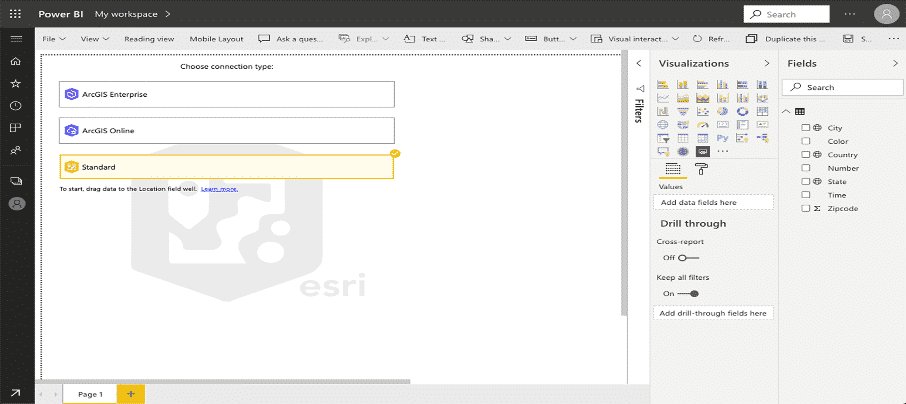
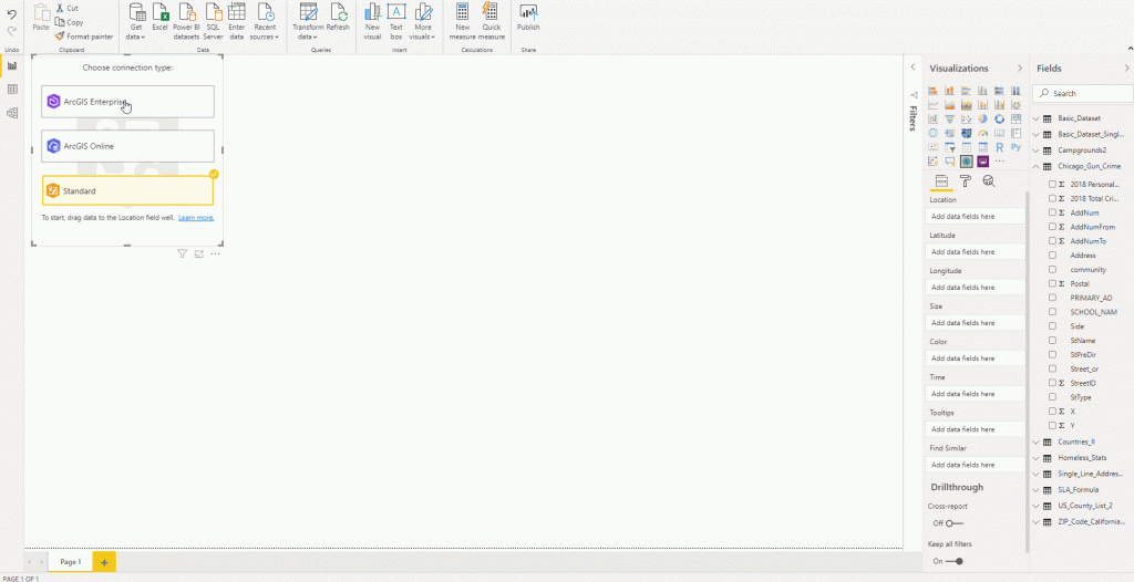
With this release of Power BI, when you click on the ArcGIS Maps for Power BI visual within Power BI, you will now see three connection options:
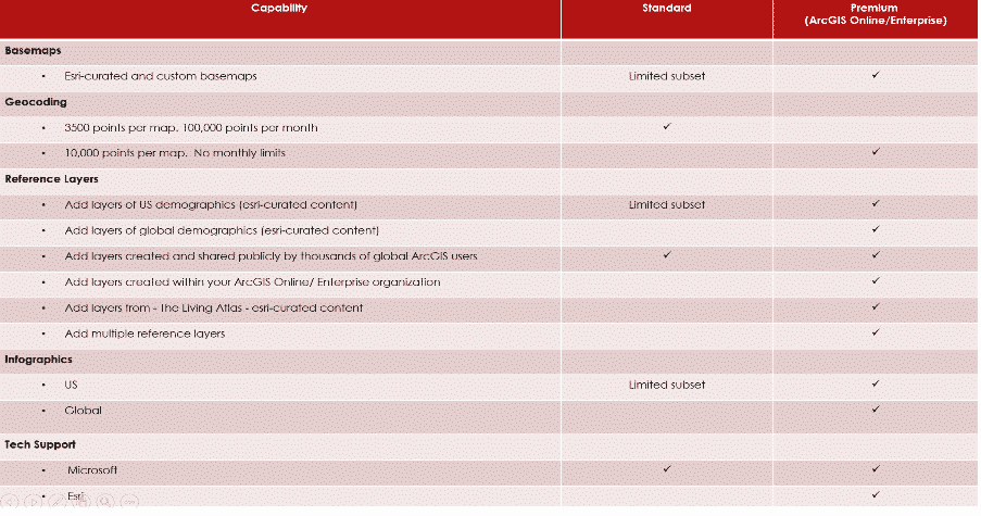
The ArcGIS Enterprise and ArcGIS Online options are for users who have the premium app subscription and provides all the capabilities of Standard and extra capabilities, including additional geocoding, technical support, and access to mapping reference layers, and more. The Standard option is free and provides basic mapping capabilities.
Enterprise support available
ArcGIS Enterprise support was released as a public preview. This means that all ArcGIS Enterprise 10.7.1 and above users can connect to their organization’s Enterprise account and use their secure GIS data in dashboards and reports within Power BI. To get started, you would need the ArcGIS maps premium subscription, and then just connect to the ArcGIS visual within Power BI and start mapping.
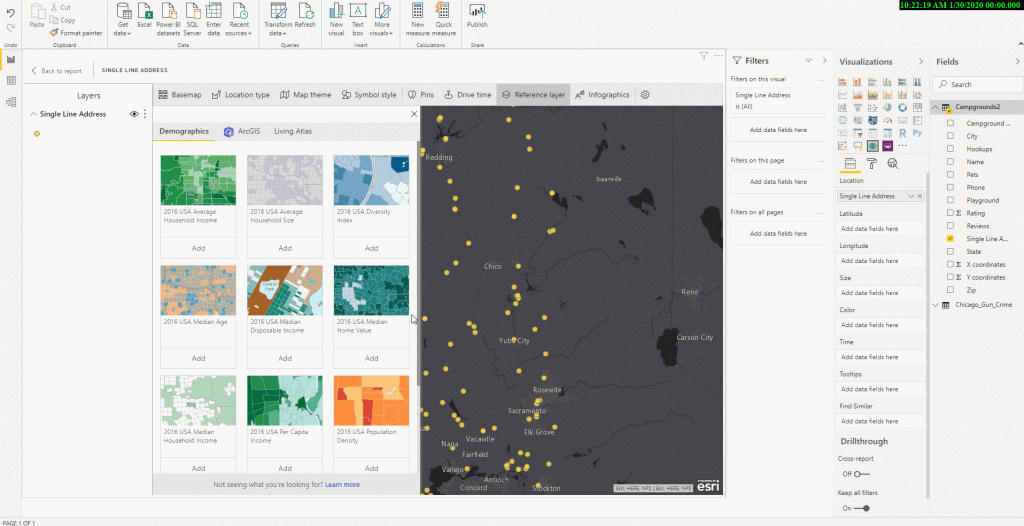
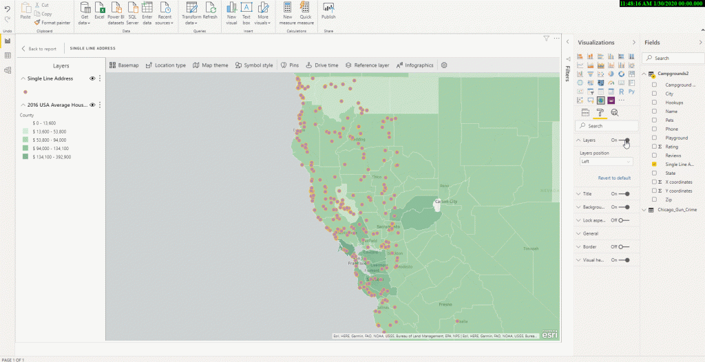
Support for Multiple reference layers
The premium app users can now add multiple reference layers to a single map visualization within Power BI. A reference layer is information represented on a map. It adds context to your operational business data. For example, let’s say you have mapped your store locations in Power BI. You can now overlay it against reference layers such as income, age, competitor locations or other demographics to gain valuable insights. You can add data and layers that are published and shared online by the ArcGIS community as well as layers from your ArcGIS Online or ArcGIS Enterprise organization.
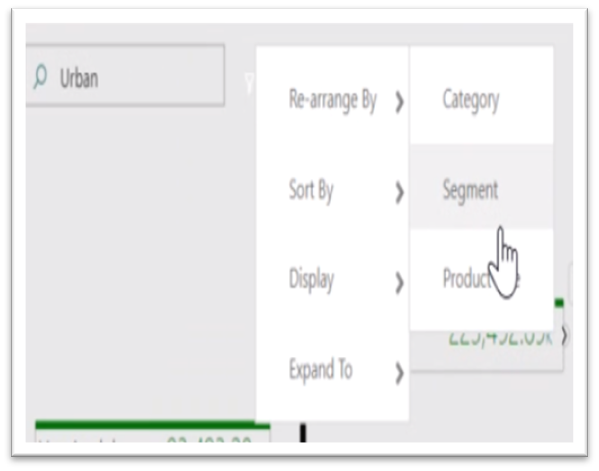
New Table of contents
A new table of contents that will help the ArcGIS Maps for Power BI users (free and premium) better visualize their data on a map. Now, when you drag data to a location field well and see it on a map, you can also see a table of contents that lists all the layers on the map and shows the features represented by the layers. This allows your report viewers to quickly understand the data that they are seeing.
The new Power BI template apps enable Power BI partners to build Power BI apps with little or no coding, and deploy them to any Power BI customer. This article is an overview of the Power BI template app program. Template apps are a replacement for the current service content packs. As a Power BI partner, you create a set of out-of-the-box content for your customers and publish it yourself. You build template apps that allow your customers to connect and instantiate within their own accounts. As domain experts, they can unlock the data in a way that’s easy for their business users to consume.
The Omnichannel Insights for Dynamics 365 supporting Chat, Bot, and SMS channels is now generally available. Omnichannel dashboard helps supervisors with insights on operational metrics across different channels, queues, bots, and agents. It also uses AI to provide in-depth sentiment analysis to help supervisors take actions to improve customer satisfaction.
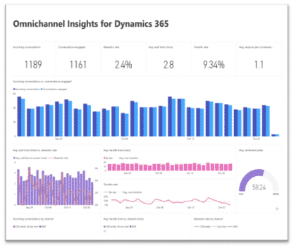
This template app has two dashboards and six visually rich report pages with filters for supervisors to get a summary on how their organization is engaging and connecting to their customers through Omnichannel for customer service.
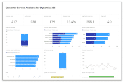
The Customer Service Analytics for Dynamics 365 is now available in power BI, which provides information about the historical operational metrics and KPIs to effectively manage contact centres. With this release, you can also download the Power BI reports and customize them to your organizational needs.
Microsoft Forms Pro is an enterprise survey capability that helps businesses obtain the feedback they need to make smarter decisions. It enables you to collect feedback using surveys and connect the survey response data with the business data to obtain meaningful insights.
If you are using Forms Pro to collect customer feedback after a case is resolved in Dynamics 365 Customer Service, you can automate the feedback collection and association of survey response data and case data using Power Automate. The Forms Pro survey response data with be stored in same Dynamics 365 organization along with your business data. The Forms Pro Customer Satisfaction app will enable you to get analytics combining survey data and case data. To connect to the Dynamics 365 Customer Service instance, you will need to provide the URL for your organization and the credentials for authentication.
This app template brings together the survey feedback and Dynamics 365 Customer Service data into a 3-page report to provide great out-of-box experience for customer service managers.
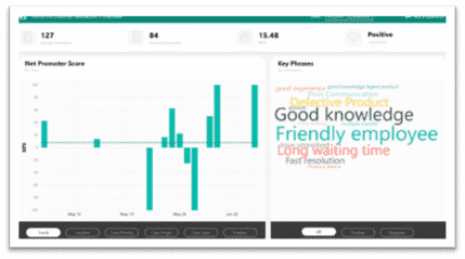
The first page contains overview of the survey response data and provides metrics like NPS, NPS trend, word cloud of the customer verbatim phrases, and number of surveys invites and responses. It also provides NPS distribution with respect to the different case parameters like location, case priority, case origin, case type and product.
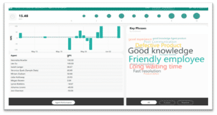
The second page provides an agent-centric view of the satisfaction data. This page will help customer service managers to analyse an agent’s performance based on the survey responses. They can view how the customer service agents are performing and what feedback the customers are providing about them.
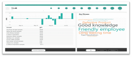
The third page provides customer-centric view of the satisfaction data, which shows the satisfaction rating trend for the customers and their feedback.
Posted in BI, Tagged Power BI, Power BI New Update, Template Apps,
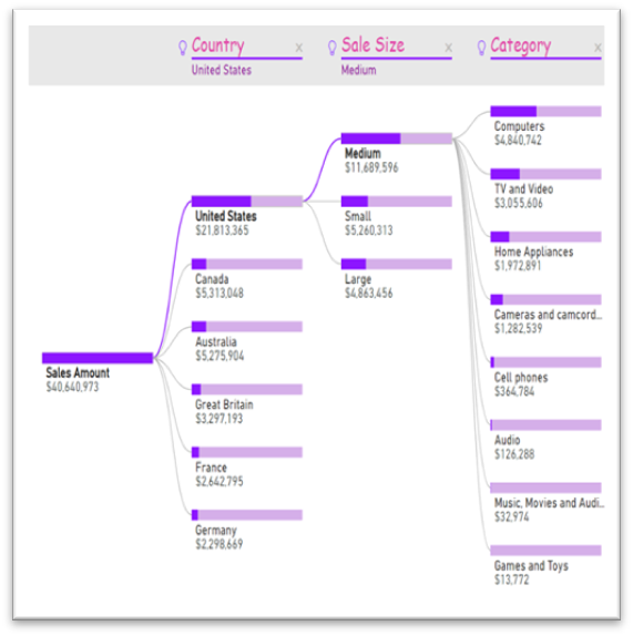
Microsoft has unveiled a feature summary for the December update to Power BI Desktop. The highlights this month include some amazing features and bunch of them are preview features, which are not only helpful but very promising, these include customizing & exporting current themes in Power BI, the all new decomposition tree visual with a lot of formatting options, Automatic page refresh for Direct Query details, bullet charts and much more.
The formatting of new decomposition tree visual with many more formatting options this month.
The new options include.
xViz has added four new visuals to their suite. As a reminder, xViz is a package of visuals with highly advanced formatting and configuration capabilities. You can use the basic capabilities for free or purchase a license that will give you access to all the visuals for one price.
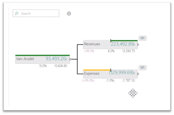
The hierarchy tree visual lets you display hierarchical data in a visually appealing tree view. This visual is similar in layout to our decomposition tree, but it allows you to compare two measures, such as budget and actual, and see the variance between them.

When your tree extends beyond the viewport, you can now continuously pan with zoom control and even a mini map to help you navigate.
You can also search for nodes with the search box in the top right, which helps when the tree is quite large.
Optionally, for each child you can also see the number of nodes that haven’t been expanded out. You can conditionally format the nodes based on the values displayed in them, and you can even control the look and precision of the values with advanced number and semantic formatting. The connector lines, the font formatting, and background and node colours can also be controlled through the formatting pane.
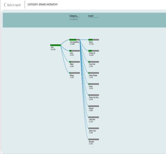
For example, we used hierarchy tree visual for stock Analysis report where it is describing about stock on hand (SOH) Metric. It is explaining both category and brand wise SOH. We are showing the particular category with brand name and SOH that we are analysing the highest and lowest SOH.
Posted in BI, Blogs,Reporting Factory: Convergytics became the reporting & analytics arm of a leading media agency in the US enhancing capabilities & providing scale
Posted in BI, Case Study, Tagged Convergytics, reporting factory,Data Fusion: Convergytics solution fused data from different channels to understand the impact of social chatter on brand imagery and sales
Posted in BI, Case Study, Tagged Convergytics, data fusion,