The new Power BI ArcGIS Maps provides
you with the ability to build beautiful maps using your data within Microsoft
Power BI. It works with all three versions of Power BI: Free, Pro and Premium.
This release to be defined by the four key updates:
Enterprise support is now generally available
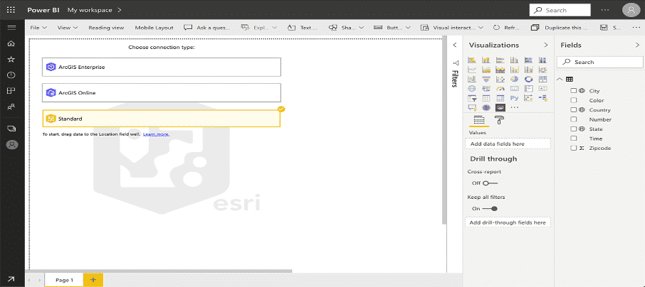
With this release of Power BI, when you click on the ArcGIS Maps for Power BI visual within Power BI, you will now see three connection options:
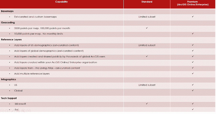
The ArcGIS Enterprise and ArcGIS Online options are for users who have the premium app subscription and provides all the capabilities of Standard and extra capabilities, including additional geocoding, technical support, and access to mapping reference layers, and more. The Standard option is free and provides basic mapping capabilities.
Enterprise support available
ArcGIS Enterprise support was released as a public preview. This means that all ArcGIS Enterprise 10.7.1 and above users can connect to their organization’s Enterprise account and use their secure GIS data in dashboards and reports within Power BI. To get started, you would need the ArcGIS maps premium subscription, and then just connect to the ArcGIS visual within Power BI and start mapping.
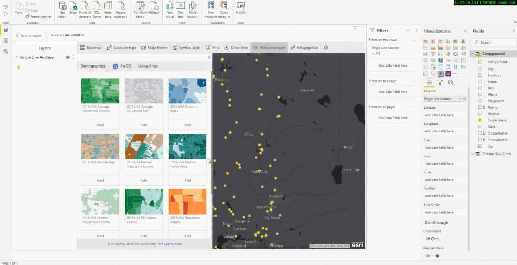
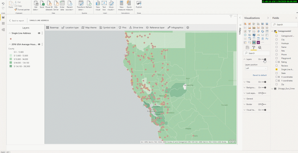
Support for Multiple reference layers
The premium app users can now add multiple reference layers to a single map visualization within Power BI. A reference layer is information represented on a map. It adds context to your operational business data. For example, let’s say you have mapped your store locations in Power BI. You can now overlay it against reference layers such as income, age, competitor locations or other demographics to gain valuable insights. You can add data and layers that are published and shared online by the ArcGIS community as well as layers from your ArcGIS Online or ArcGIS Enterprise organization.
New Table of contents
A new table of contents that will help the ArcGIS Maps for Power BI users (free and premium) better visualize their data on a map. Now, when you drag data to a location field well and see it on a map, you can also see a table of contents that lists all the layers on the map and shows the features represented by the layers. This allows your report viewers to quickly understand the data that they are seeing.
PM Narendra Modi declared a three-week nationwide lockdown starting midnight Tuesday, explaining that it was the only way of breaking the Covid-19 infection cycle. This essentially extended the lockdown from most states and Union Territories to the entire country and provided a more definite timeline. “Social distancing is the only way to break the cycle of infection,” he said.

All other lockdown conditions, such as the availability of essential commodities, remain the same, the government clarified.
In
his second address to the nation on the Covid-19 outbreak, Modi told people to
stay inside their homes for 21 days, warning that if they didn’t do so the
country would be set back 21 years and families would be destroyed. His last
address was on the outbreak was on March 19.
“This is like a curfew, and far stricter than the ‘Janata Curfew’ (on March 22),” the PM said. “Seeing the present conditions, this lockdown will be for 21 days. This is to save India, save each citizen and save your family. Do not step outside your house. For 21 days, forget what is stepping outside. There is a Lakshman Rekha on your doorstep. Even one step outside your house will bring the coronavirus inside your house.”

The World Health Organization has declared the coronavirus, or COVID-19, a pandemic. It’s an uncertain time with lots of unknowns, and while we don’t have all the answers, we want to share what we do know and offer some guidance for our customers and other small businesses that may be experiencing shifts in their business.
This pandemic is affecting the health of the public, and it’s also impacting the economy. According to Google, “since the first week of February, search interest in coronavirus increased by +260% globally.” While spikes in search trends are common during events of this scale, there have also been surges in traffic for related products and topics as a direct response to the pandemic.
Over the past week, remote working has quickly gone from a company-specific arrangement to city-wide and, in some cases, statewide emergency policy as local governments across the country scramble to contain the spread of Covid-19. As of this week, major cities across the India., including Bengaluru, Delhi and Heydrabad, have either initiated or are considering the shelter-in-place mandate, urging residents to work from home and stop all nonessential travel. It may be nice to avoid commuting and work from your living room couch every once in a while, but how, in the long run, this sudden change could affect productivity, morale and even job security, is an unsettling question to both employers and employees.
“It’s nobody’s choice to work from home [in the current situation]. Day one is probably easy and nice. Day 20 can be pretty hard. And no one knows what it will be like if this goes on for two months,
Here are a few tips from Golden to make working from home successful, based on his own experience running a remote working company:
1) Establish a dedicated work space. Working from the kitchen table or couch might be easy, but setting up a dedicated desk will make you happier and more productive.
2) Establish a morning routine and stick to it. Just because you are working remotely doesn’t mean you don’t need to get ready in the morning. While some people enjoy working in their pajamas, many find that getting ready like they were going to the office helps them maintain focus and work effectively.
3) Make sure your tech works. Invest in reliable internet access and a good router, and be prepared to use your phone as a backup.
4) Create an online “small talk” space with coworkers. Create general conversation slack channels, spend some time making small talk in our video calls and meetings, and generally put an emphasis on getting to know each other
Posted in Blogs,
Azure Data Factory is a cloud-based data integration service that allows you to create data-driven workflows in the cloud for orchestrating and automating data movement and data transformation.
Azure Data Factory does not store any data itself. It allows you to create data-driven workflows to orchestrate the movement of data between supported data stores and processing of data using compute services in other regions or in an on-premise environment. It also allows you to monitor and manage workflows using both programmatic and UI mechanisms.
Azure Data Factory (ADF) is a service. It used to transform all their raw big data from relational, non-relational and other storage systems and integrate it for use with data-driven workflows to help companies map strategies, attain goals and drive business value from the data they possess.
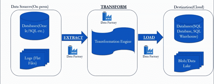
Let’s take an example, there is an organization who have lot of data on premise. The data has store across multiple databases like oracle, MYSQL, SQL server and also, there are flat file data like nothing but log files and auditing data. As an organization of rapidly expanding the data of volume and also increase exponentially. To meet the demand of exponentially data volume that organization decide that move to data centre all databases to cloud for get all the benefits of flexibility, scalability and show on.
To transfer or perform the data to cloud the organization has follow the process:
The Data Factory service allows you to create data pipelines that move and transform data and then run the pipelines on a specified schedule (hourly, daily, weekly, etc.). This means the data that is consumed and produced by workflows is time-sliced data, and we can specify the pipeline mode as scheduled (once a day) or one time.

So, what is Azure Data Factory and how does it work? The pipelines (data-driven workflows) in Azure Data Factory typically perform the following three steps:
By using Data Factory, data migration occurs between two cloud data stores and between an on-premise data store and a cloud data store.
Copy Activity in Data Factory copies data from a source data store to a sink data store. Azure supports various data stores such as source or sinks data stores like Azure Blob storage, Azure Cosmos DB (Document DB API), Azure Data Lake Store, Oracle, Cassandra, etc. For more information about Data Factory supported data stores for data movement activities, refer to Azure documentation for Data movement activities.
Azure Data Factory supports transformation activities such as Hive, MapReduce, Spark, etc that can be added to pipelines either individually or chained with other activities. For more information about Data Factory supported data stores for data transformation activities, refer to the following Azure documentation: Transform data in Azure Data Factory.
If you want to move data to a data store that Copy Activity doesn’t support, you should use a .Net custom activity in Data Factory with your own logic for copying data. To learn more about creating and using a custom activity, see Use custom activities in an Azure Data Factory pipeline.
Posted in Blogs, Tagged Azure Data Factory,
Microsoft has unveiled a feature summary for the December update to Power BI Desktop. The highlights this month include some amazing features and bunch of them are preview features, which are not only helpful but very promising, these include customizing & exporting current themes in Power BI, the all new decomposition tree visual with a lot of formatting options, Automatic page refresh for Direct Query details, bullet charts and much more.
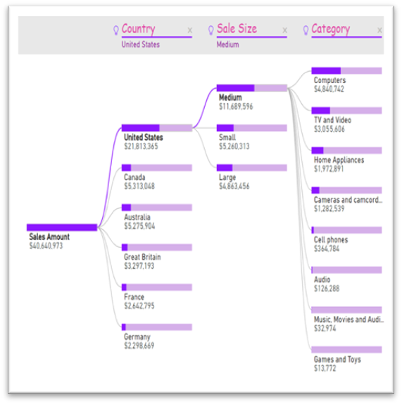
The formatting of new decomposition tree visual with many more formatting options this month.
The new options include.
xViz has added four new visuals to their suite. As a reminder, xViz is a package of visuals with highly advanced formatting and configuration capabilities. You can use the basic capabilities for free or purchase a license that will give you access to all the visuals for one price.
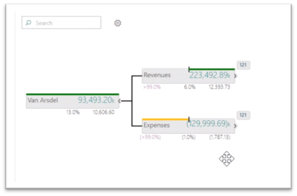
The hierarchy tree visual lets you display hierarchical data in a visually appealing tree view. This visual is similar in layout to our decomposition tree, but it allows you to compare two measures, such as budget and actual, and see the variance between them.
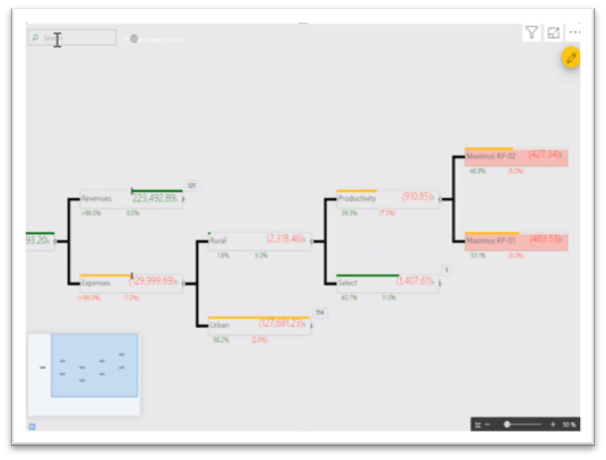
When your tree extends beyond the viewport, you can now continuously pan with zoom control and even a mini map to help you navigate.
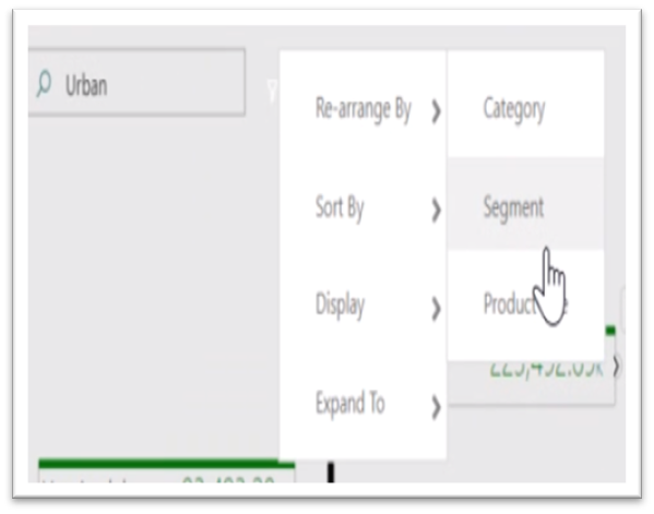
You can also search for nodes with the search box in the top right, which helps when the tree is quite large.
Optionally, for each child you can also see the number of nodes that haven’t been expanded out. You can conditionally format the nodes based on the values displayed in them, and you can even control the look and precision of the values with advanced number and semantic formatting. The connector lines, the font formatting, and background and node colours can also be controlled through the formatting pane.
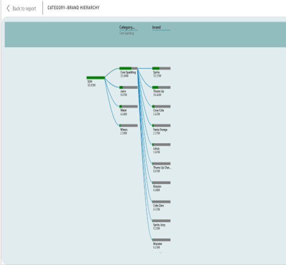
For example, we used hierarchy tree visual for stock Analysis report where it is describing about stock on hand (SOH) Metric. It is explaining both category and brand wise SOH. We are showing the particular category with brand name and SOH that we are analysing the highest and lowest SOH.
Posted in BI, Blogs,Is your data telling the right story? We have done a tag audit for many clients who are concerned that they do not have accurate data from Adobe Analytics. Below are a few steps to help your organisation drive data-driven decisions, be confident in your marketing strategy and leverage all the best features of Adobe Analytics.

Below are a few best practices that will help you make Adobe Analytics as your primary analytics tool and help you get most out of your Adobe Marketing Cloud investments.
Gathering the requirements exhaustively is very essential to complete the implementation on time and in avoid rework. Discuss what data needs to be collected, whether getting the required data is possible, what marketing channels are involved, how the data should be processed, how the data should be reported and then finally, list out any exclusions.
Probably one of the most overlooked aspects of Adobe Analytics implementation is planning. Many marketers skip the planning and jump straight into the implementation phase which could result in rework, missed deadlines, additional resources and unexpected results. Create a project plan to outline all the various steps required to carry out the implementation, list key deliverables and list resources required from client’s end to carry out the implementation.
Creating a Solution Design Reference (SDR) is the cornerstone of Adobe Analytics implementation and it will be the focal point of all the activities related to tag implementation. Even if you have implemented Adobe Analytics many a times, it is important to maintain the SDR up-to-date with each change. As important as documentation is the need to get the sign-offs on the document at regular intervals as well.
The Adobe Analytics data reported may not exactly match with the Client’s internal database, so it is important to set correct benchmark of accuracy so that the expectation can be set right from the outset. This should be setup as part of the testing process before a switch-over happens.
Important technical recommendations that can be used as a checklist to ensure all aspects of Adobe Analytics implementation are discussed here. Although the Adobe Analytics implementation guide covers the complete implementation in detail, it is not possible to list out all the technical aspects as they may vary depending on the nature of business, underlying technology used and a host of other factors.
Test the Tealium Data Layer Variable to ensure that required data is available as per business requirements, so that it can be sent to analytics. The Tealium Data Layer forms the backbone of Analytics Implementation; hence it is important to periodically perform validation to ensure that the data is populated as expected. If the required data is already available in the data layer, it may not use the JavaScript Extensions to capture this information dynamically. Tealium offers predefined data layer variables that can speed up the code deployment process and provide various extensions which are helpful to get required information from the website.
We recommend implementing the Adobe Analytics using the JavaScript AppMeasurement Library as it is faster, provides native support for several common plugins and provides native utilities such as query parameters, read and write cookies and advanced link tracking. Some of the plug-ins are no longer supported in the updated version, hence one must check the adobe AppMeasurement plug-in support for additional details.
Setting up the report suite to ensure the required data is passed to the correct eVars, props and merchandising variables.
Probably this is the first thing that will be captured in Adobe Analytics. This information will be a key factor for most of the analysis performed on the website, so keep it simple, unique, friendly and consistent across the website. Effective use of Set Data Extension will be helpful in achieving this.
Avoid sending the same information across different variables as Adobe Analytics offers many ways (processing rules, classifications) to manipulate the information passed. This would also result in restricted usage of variables.
It is better to have one JavaScript Extension to populate the information required for passing to Adobe Analytics otherwise this will result in conflict and the order of execution of various information populated will decide the outcome of result. Hence one must do this diligently.
Using the above-mentioned key factors have significant importance in effectively implementing Adobe Analytics and the user-friendly interface provided by Tealium will only make the implementation journey memorable and easy to maintain.
Chaitanya Kayasri heads Digital Analytics and BI at Convergytics. Chaitanya has over 13 years of consulting experience with the likes of Netapp, Verizon, DSW, Coca Cola, Excelity, Swiggy, Landmark, Aditya Birla, Henkel and many others. She has conducted webinars and workshops on Power BI and Digital Analytics and most recently presented her views at AI Round Tables in Bangalore and Chennai. She can be reached at [email protected]. You can also connect with her at https://www.linkedin.com/in/chaitanya-kayasri-91336825/
Posted in Blogs, Conversion Rates, Digital, Marketing, White Paper, Tagged Digital, Implementation, Marketing, Tag Management,